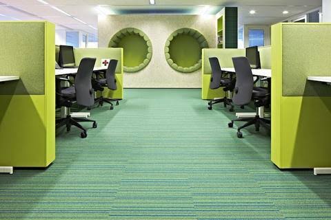
Colour plays an important role in the world of commercial interior design, influencing the atmosphere, mood, and perception of spaces. However, getting hold of the power of colour needs more than just an eye for aesthetics; it involves a deep understanding of colour theory and psychology.
So let us get into the dimension of “Color Psychology in Commercial Spaces,” and explore how strategic colour combination can shape the experiences of customers, employees, and visitors.
Colour theory is a crucial concept in art and design, focusing on how colours interact harmoniously to create visually pleasing compositions. The colour wheel acts as a guide, arranging colours based on their relationships. Primary colours, red, blue, and yellow, are foundational and mixed to form secondary colours, while additional combinations result in tertiary colours.
Moreover, it is essential to understand colour combinationtheory along with the concepts of hue, saturation, and brightness. Hue signifies the colour itself, saturation measures its intensity, and brightness determines its lightness or darkness.
In addition, the strategic use of complementary colours, positioned opposite each other on the wheel, produces a bold contrast. Analogous colours, located adjacent to each other, offer a pleasing harmony. Triadic and tetradic colour schemes involve the artful integration of three or four colours, respectively, ensuring a balanced palette.
Thus, extending beyond art, colour theory influences fields such as psychology, marketing, and design. Proficiency in these principles helps artists and designers create specific emotions, convey messages, and craft aesthetically pleasing compositions through mindful colour selection.
Considerations of Color Psychology
Colour psychology goes beyond aesthetics, focusing on how colours influence human emotions, thoughts, and actions. Red may evoke energy and passion, while blue exudes calmness and professionalism.
However, it’s crucial to remember that colour psychology is not universal and can be influenced by context, culture, and individual preferences. Collaborating with clients and users to test and evaluate colour choices ensures alignment with brand identity and resonates with the target audience.
A simple yet effective guideline for balancing colour in commercial spaces is the 60-30-10 rule. This rule recommends dividing the colour scheme into three parts: 60% dominant colour, 30% secondary colour, and 10% accent colour.
Additionally, the dominant colour sets the tone, the secondary colour adds interest, and the accent colour creates focal points. Adaptable to various colour schemes, this rule provides a structured approach to achieving visual balance.
Harnessing the effects of warm and cool colours is a sophisticated strategy for creating the desired ambience. Warm colours (reds, oranges, yellows) can evoke a cosy and stimulating feel, while cool colours (blues, greens, purples) offer a soothing and refreshing effect.
Thus, by strategically blending these hues in walls, furniture, accessories, and lighting, designers can strike a harmonious balance tailored to the project’s objectives and style.
Neutrals (white, black, grey, beige, brown) and naturals (inspired by nature) act as stabilizing elements in colour schemes. Integrating neutrals as a base or buffer and naturals for organic beauty can create a sense of harmony, elegance, and sophistication. Moreover, these elements contribute to a well-rounded design, preventing overwhelming colour dominance.
When it comes to commercial interior design, colour is a tool of immense power. Through the thoughtful integration of colour theory, psychology, and practical guidelines like the 60-30-10 rule, designers can craft spaces that not only look appealing but also resonate with the intended emotions and behaviours of the occupants.
Thus, by understanding the psychology behind colour combinations, we can get the potential to shape experiences and make a lasting impact on those who interact with the designed environment.

